Rock Rapture Photography
Introduction
Details
Client :
Rock Rapture
Location :
Altoona, Pennsylvania
Category :
Full Brand Package
Industry :
Concert Photography
Year :
2025
Credits
Lead Brand / Logo / Graphic Designer :
Josh Long
Web Designer :
Josh Long + Aubrey Stuart
Photography :
Rose Mickel
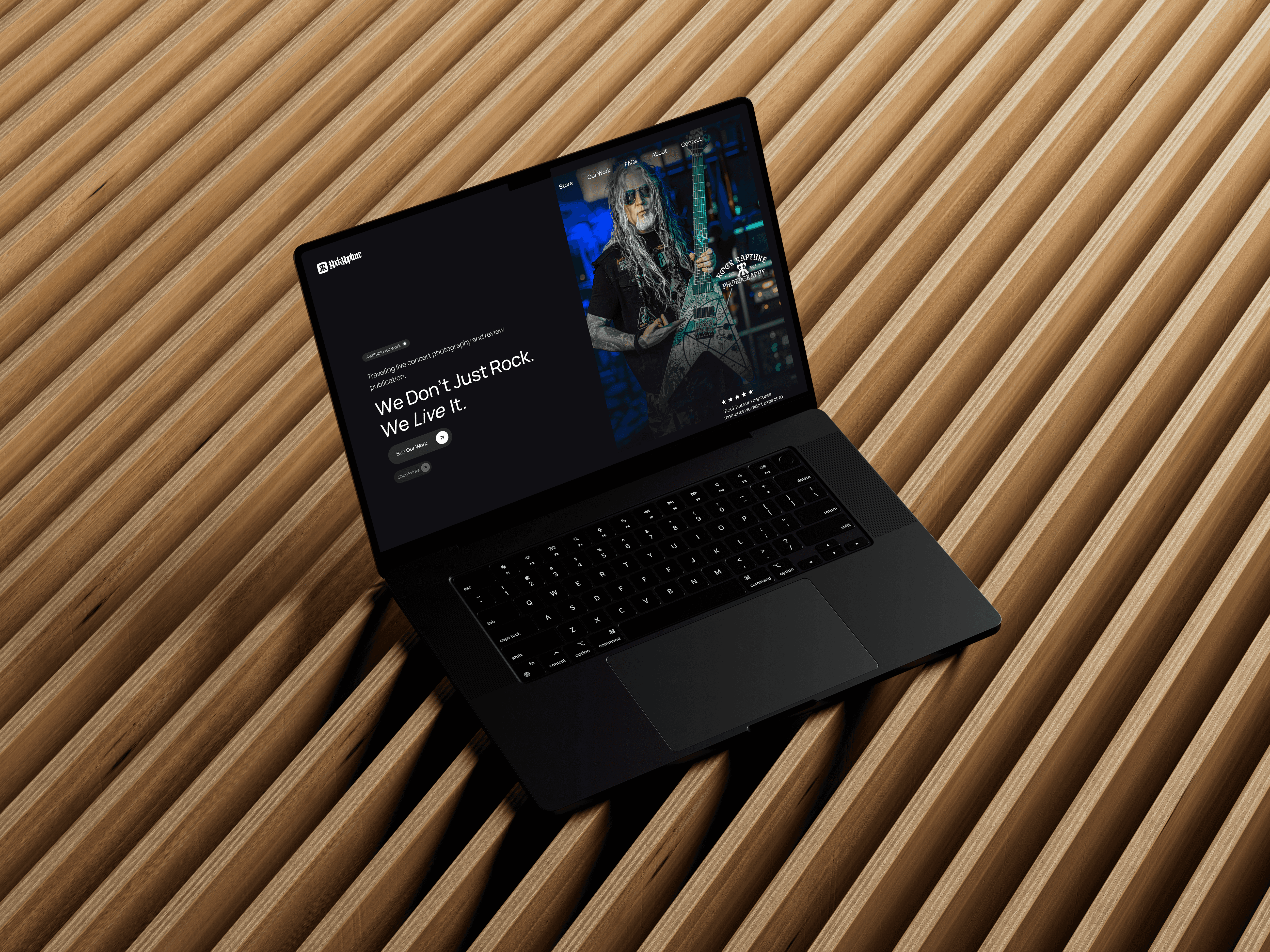
The Challenge
As Rock Rapture was looking to brand itself, they wanted something that spoke to the nature of their lifestyle. They wanted to see elements of photography and potentially even a rose. As we drafted, we researched the intricacies of photography as well as iconic cultural elements in the rock community. The owner also mentioned she wanted something that she could get tattoo'd, which was a fun challenge!
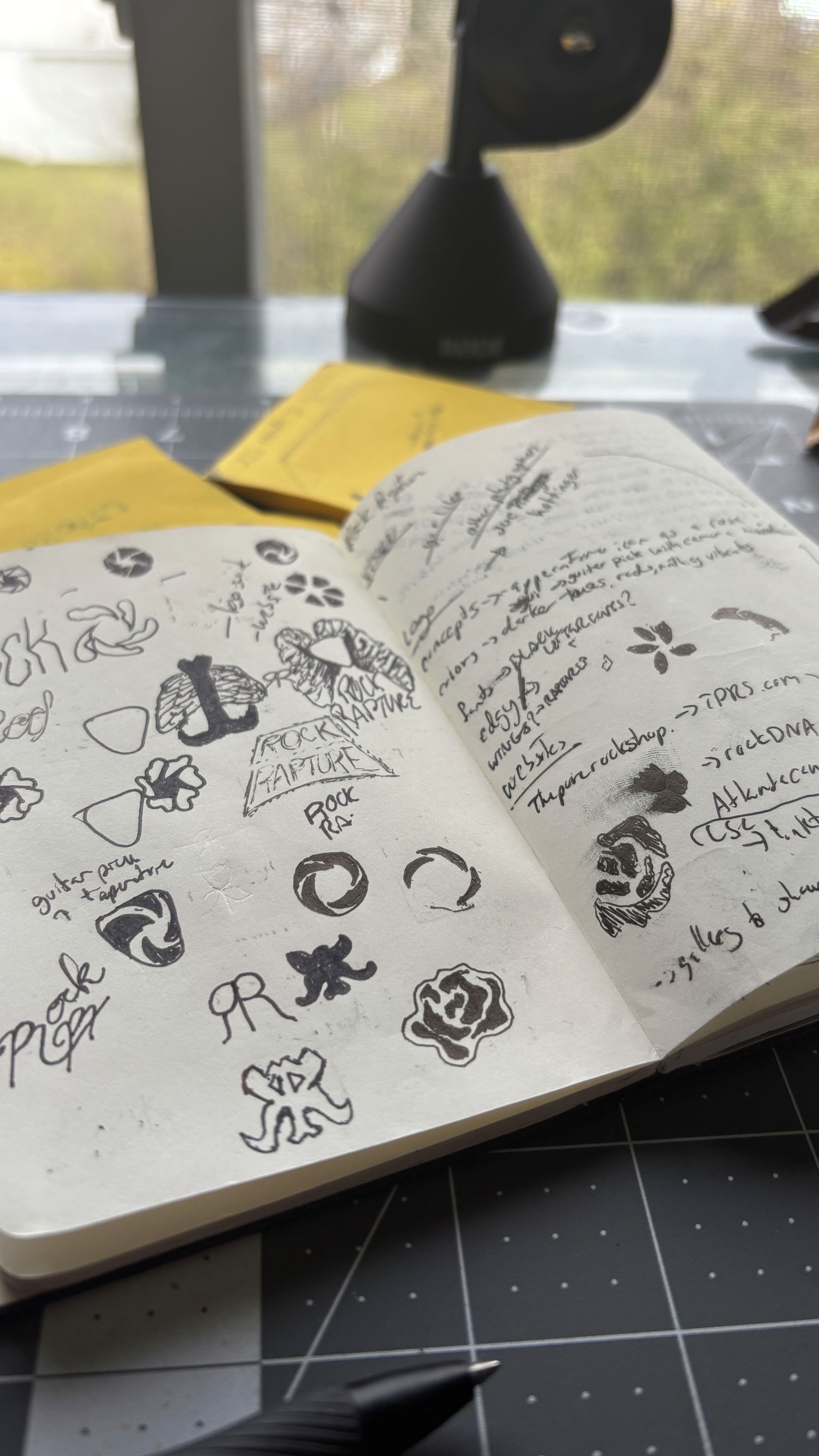
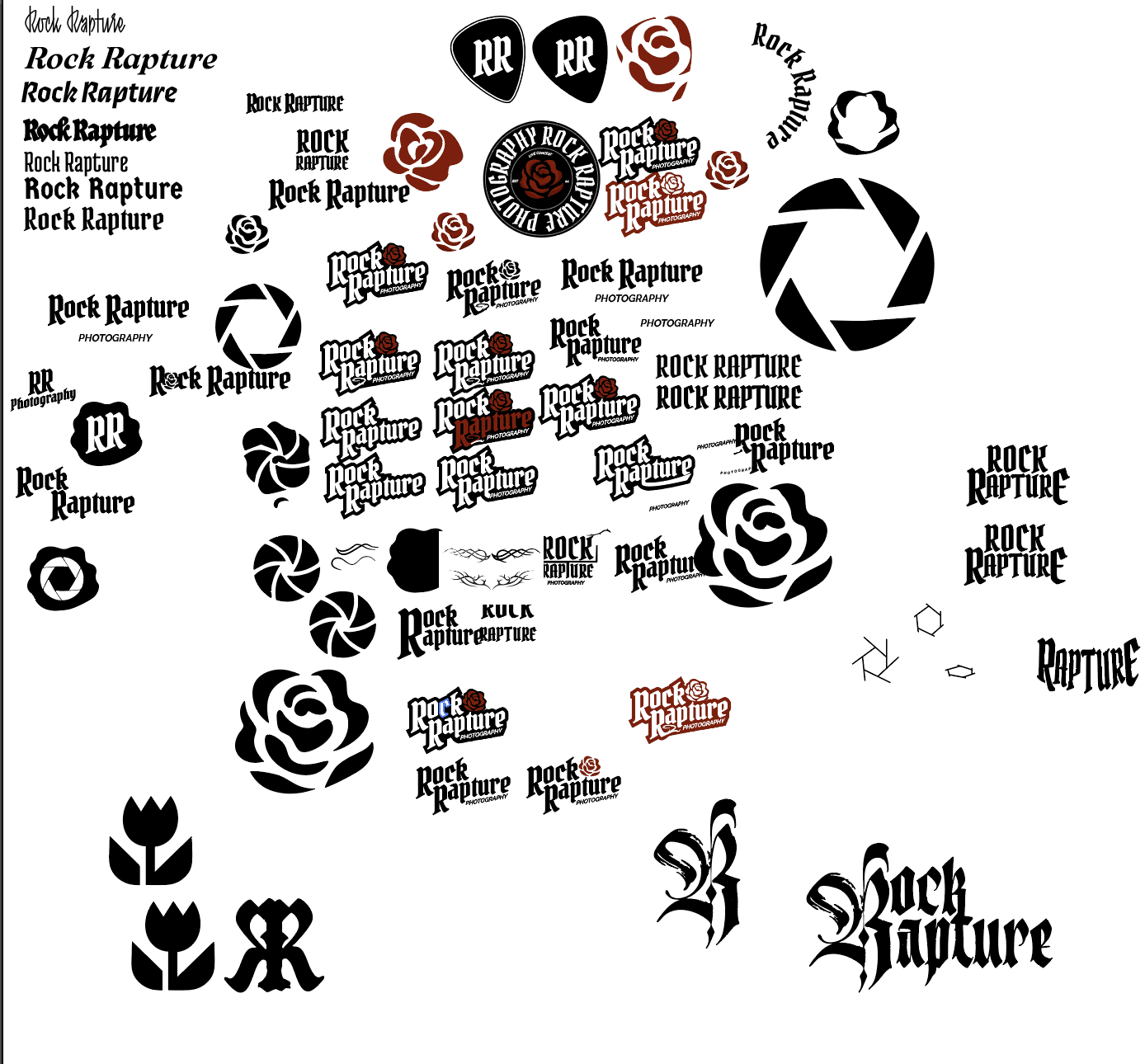
Our Solution
Experimenting with different shapes, fonts and cultural norms in their industry, we wanted to incorporate sharper edges, grungier textures, darker colors and verbiage that screams "anti-culture" and free spiritedness.
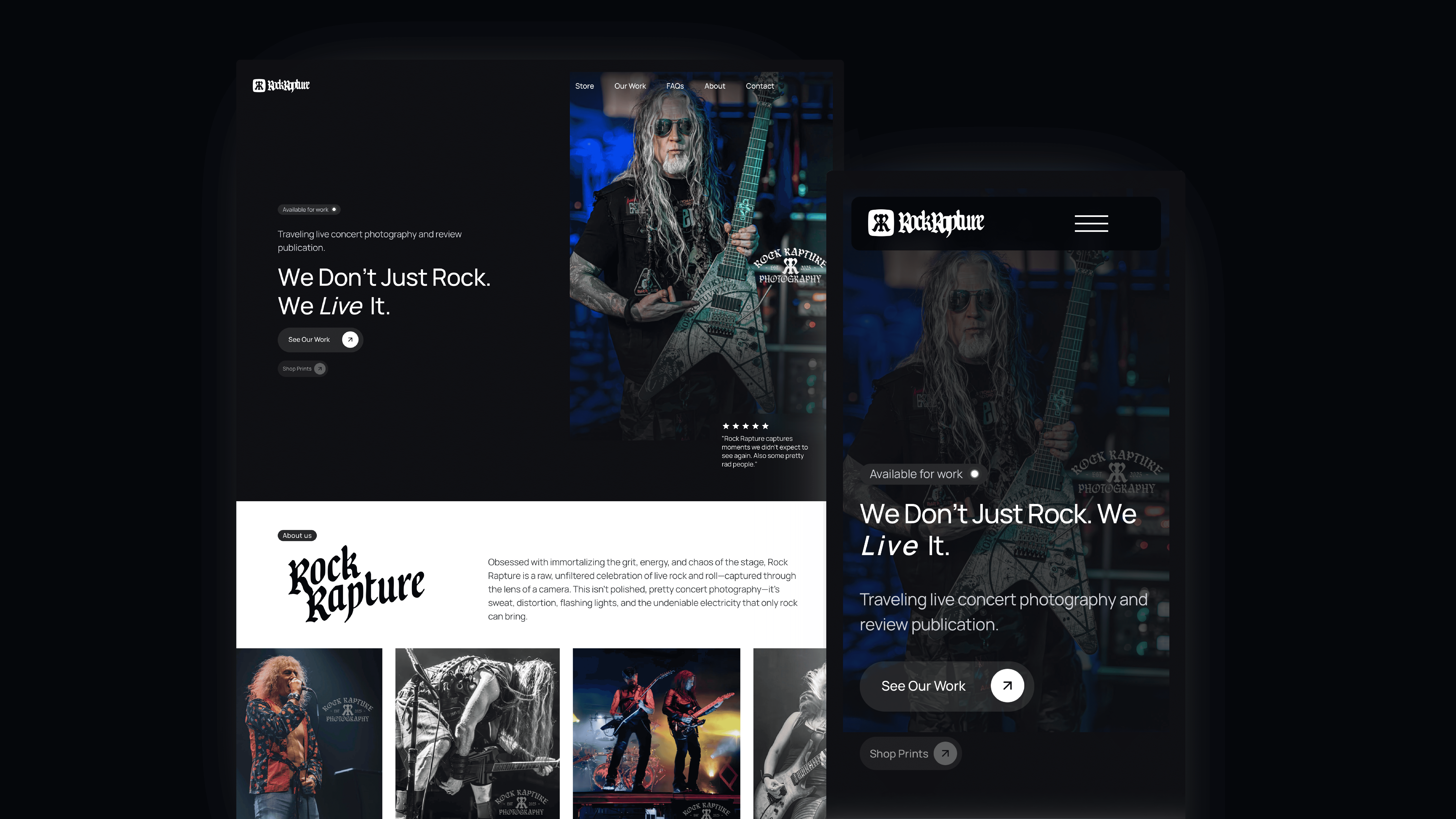
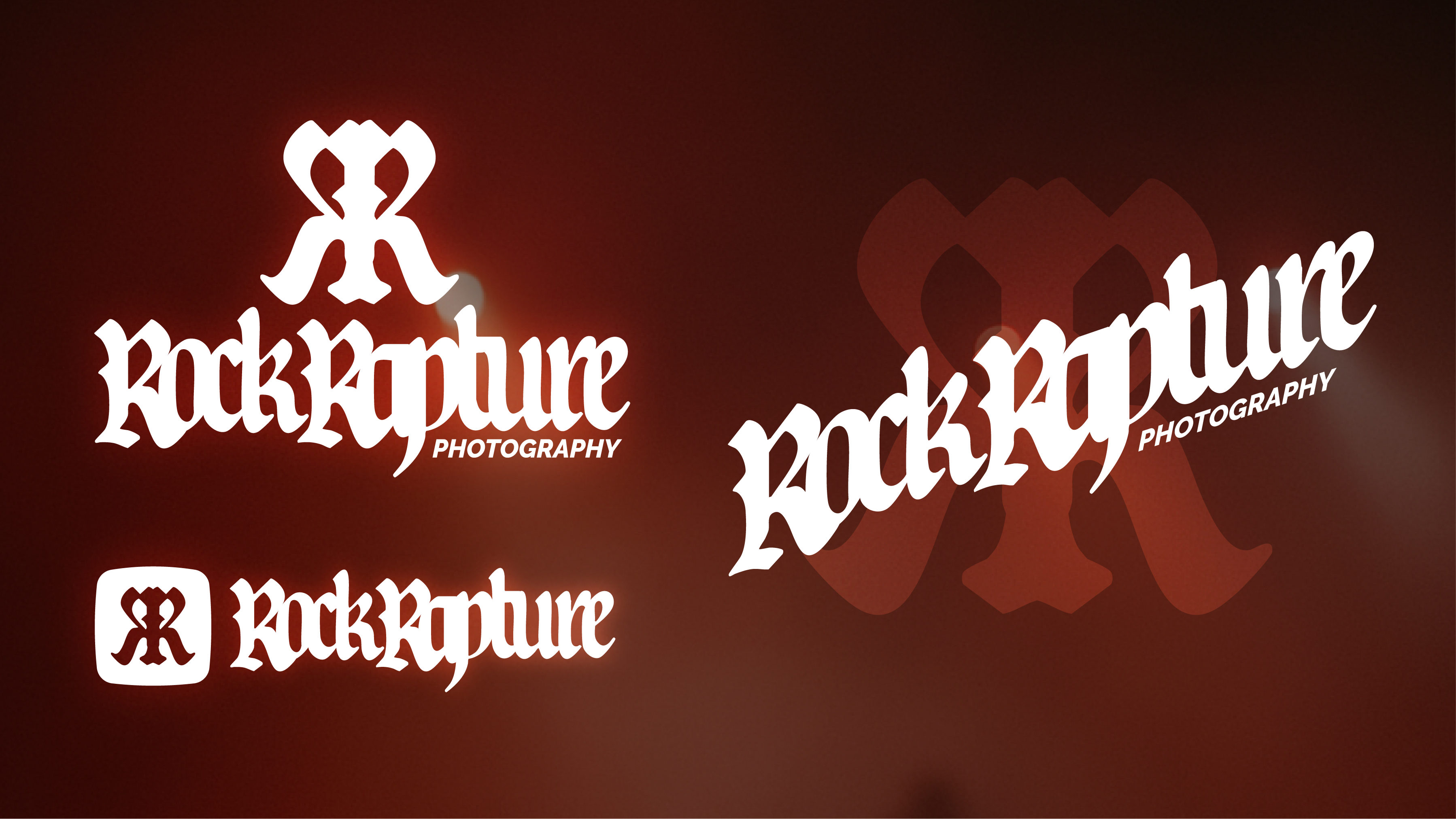
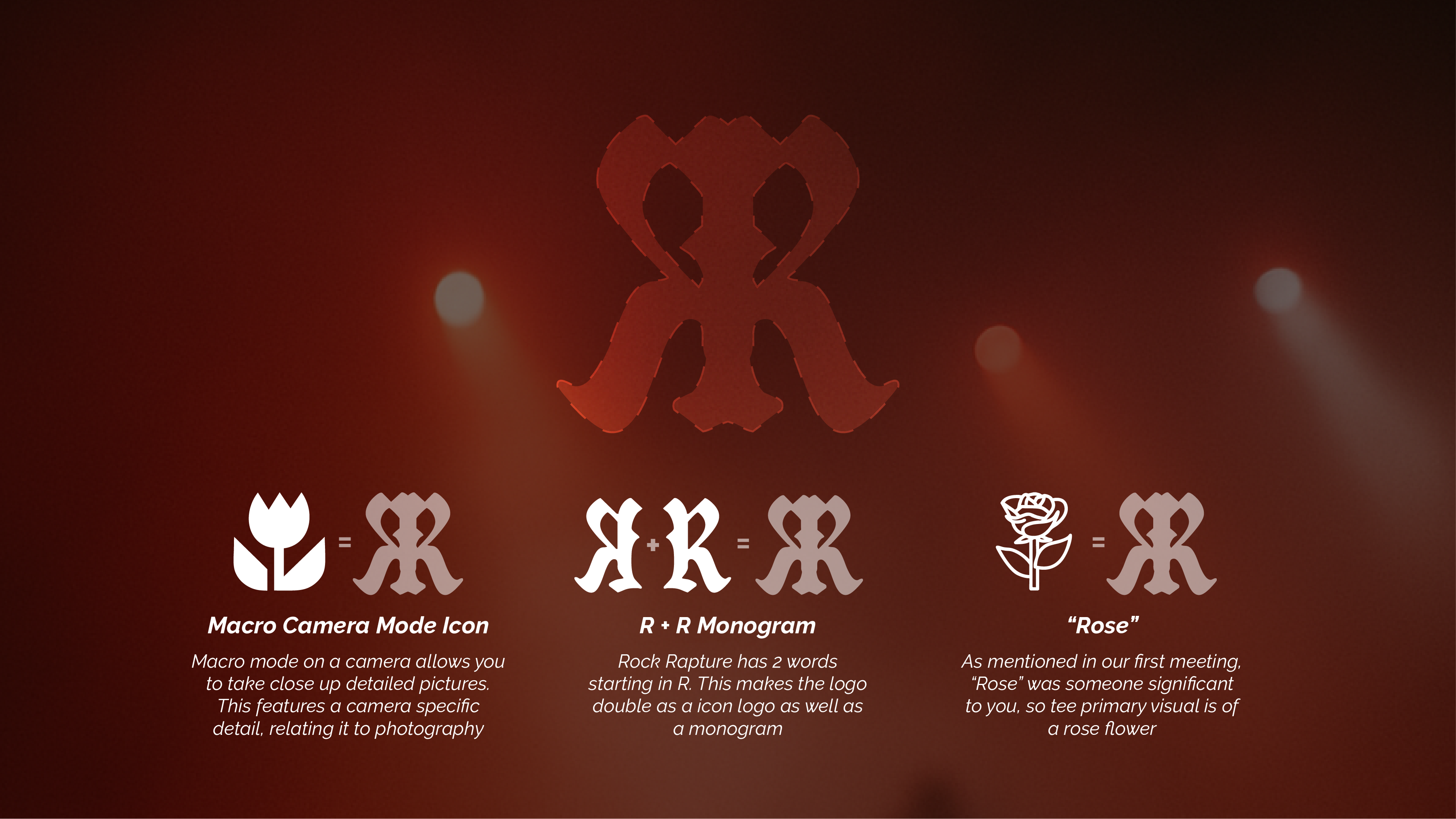
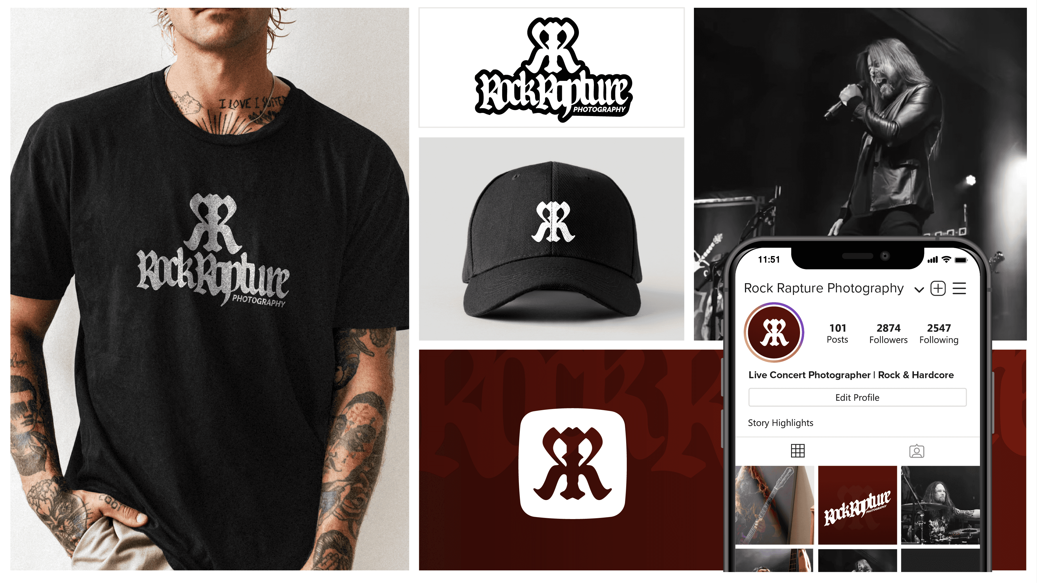
The Outcome
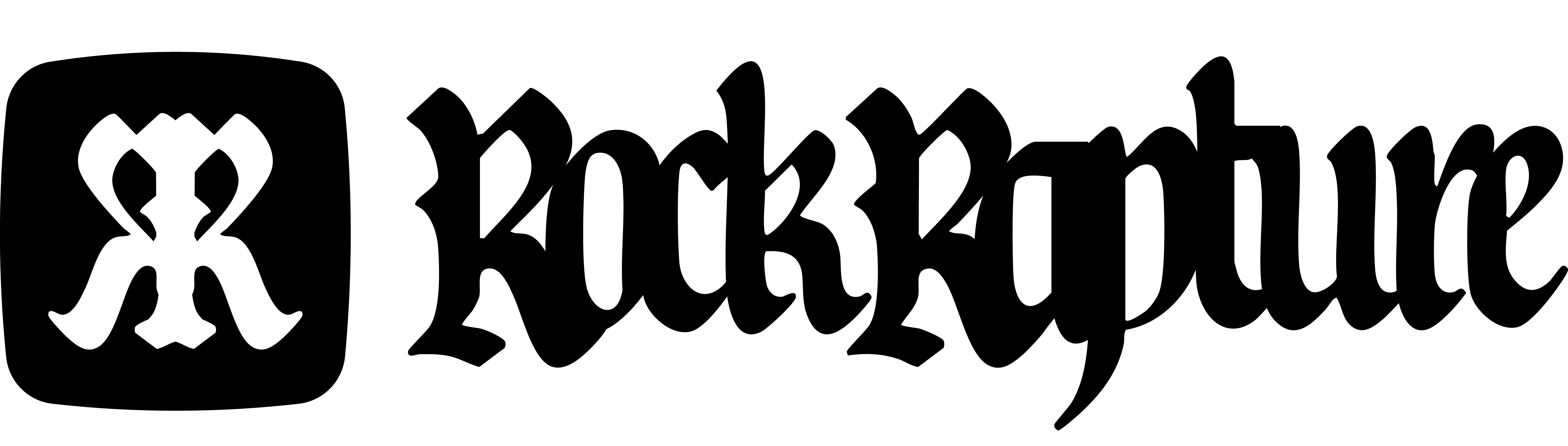
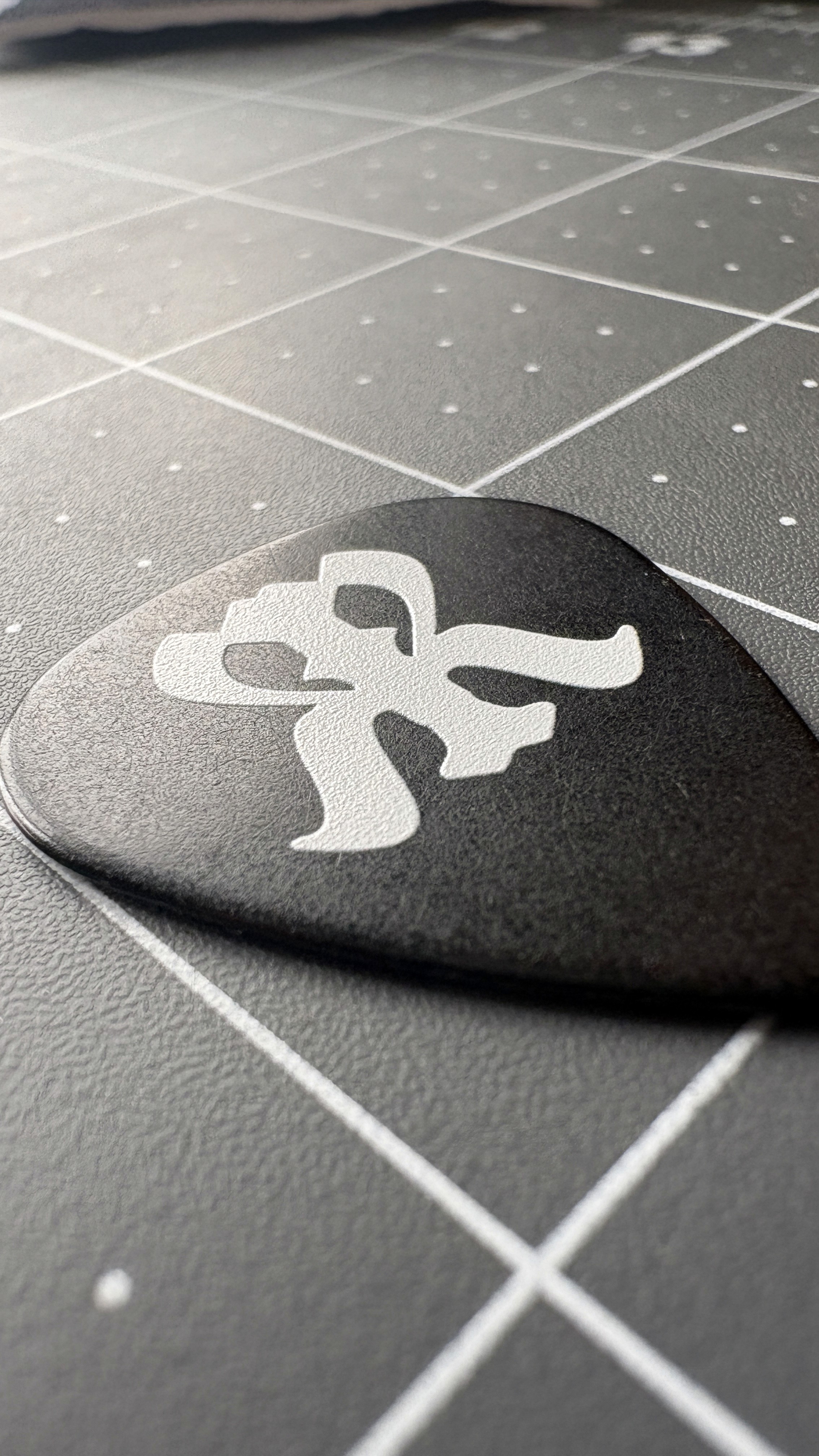
We called this logo the "RoseBone" as a humorous nickname that ended up sticking. Our clients loved it! It features the imagery of a rose, as desired by the client, which is also the picture of the "macro" setting on a camera. It is made from the "R" flipped, giving us a monogram as well. It was styled using harder edges with overlapping kerning to achieve a grungy aesthetic. The icon styling also resembles tattoo art, perfect to get printed on your skin forever!

